


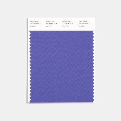
The Pantone color of year took many by surprise, but you might just be shocked at how lovely it is when incorporated into your floral design…
| I remember where I was when I got the news about the new Pantone of the Year color, Very Peri… I disgustingly looked down at my phone and was mortified by the bight blueish-purple color that looked more like it belonged to a Veggie Tales character than on a beautifully produced wedding tablescape. |
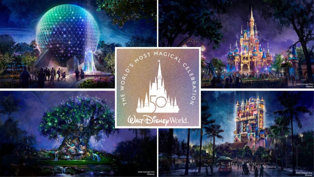
But… as the news began to settle, I began looking for Very Peri in the wild. And honestly, I didn’t hate what I was seeing. At that time, I was at Walt Disney World celebrating the 50th Anniversary Celebration. As it would be Disney decided on an “ear-idesent” color palette for the celebration. And, can you believe it, there is our very own Very Peri hanging out ALL over that color palette. I was shocked…
Seeing Very Peri in the wild helped me to think outside the box in terms of this vibrant color. Slowly, I began to see some ways to incorporate touches of it in your color palette and florals. Here are a few of my favorite examples…
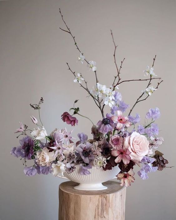
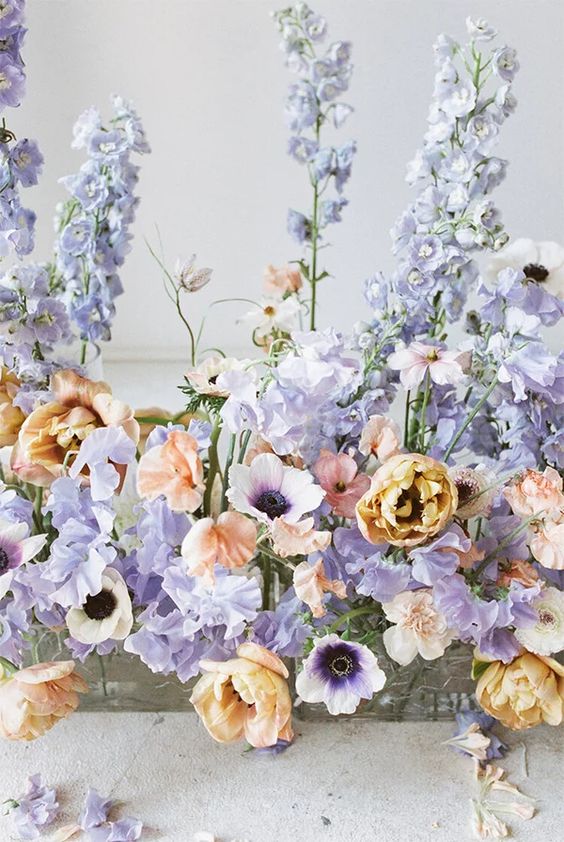
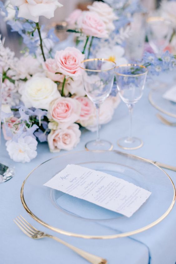
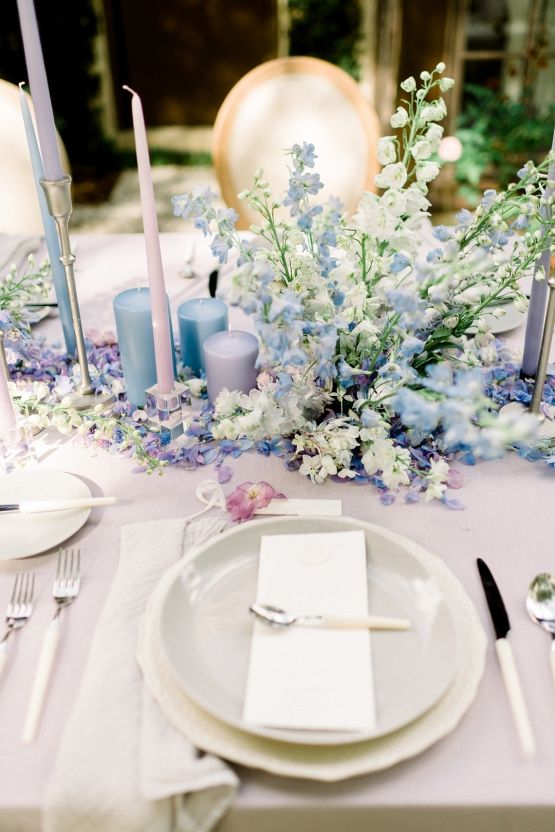
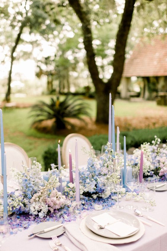
- In a monocromatic design
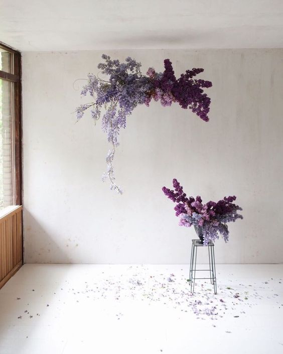
- As a large-scale statement piece
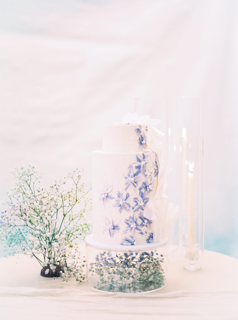
- Accenting other pastel colors
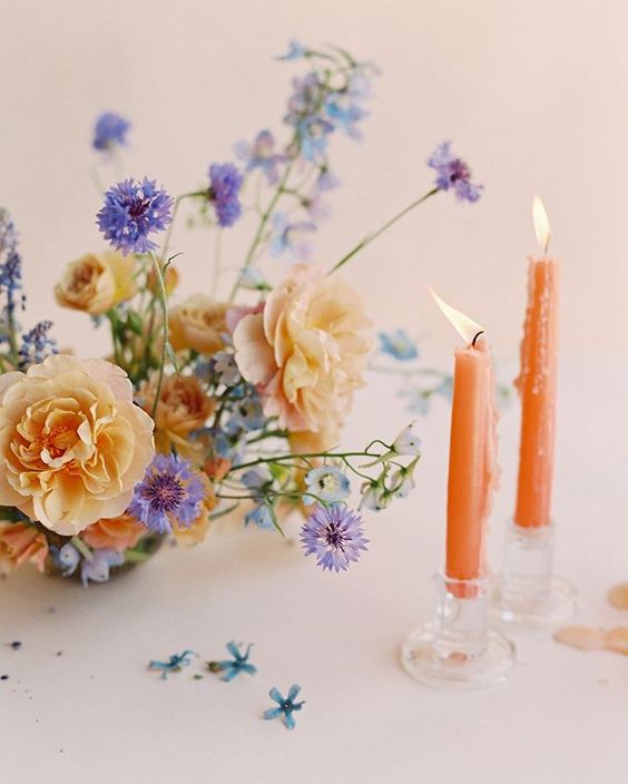
- Bringing warmth through a taper candle
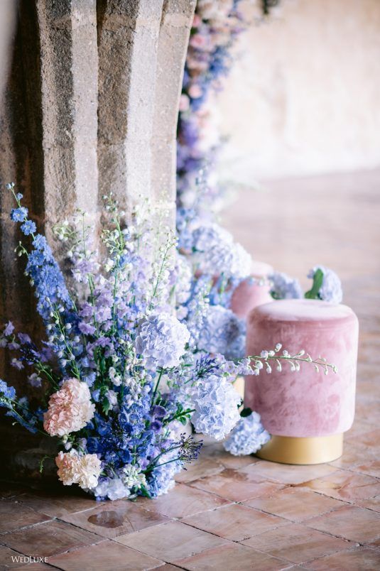
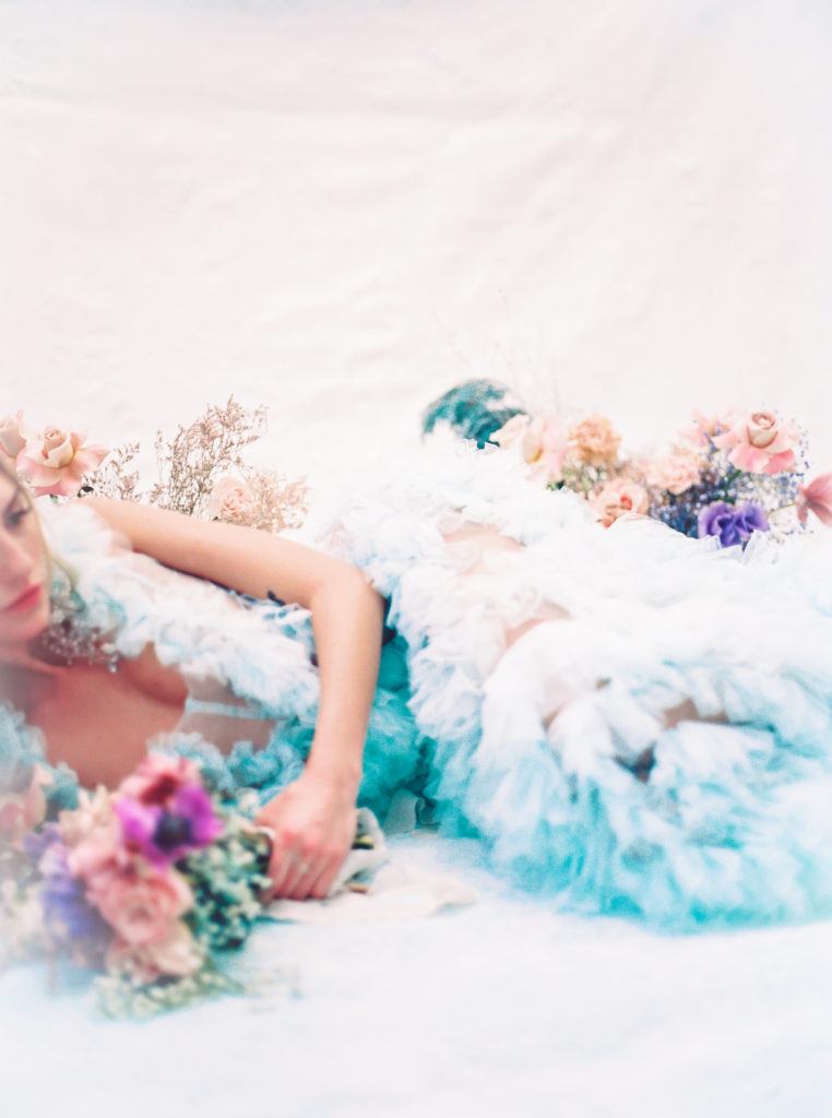
- Mixed and matched in a cool color palette
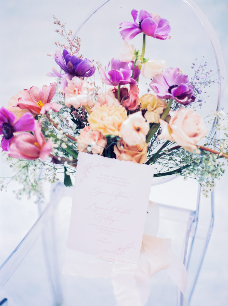
- A fun, bright surprise in an arrangement
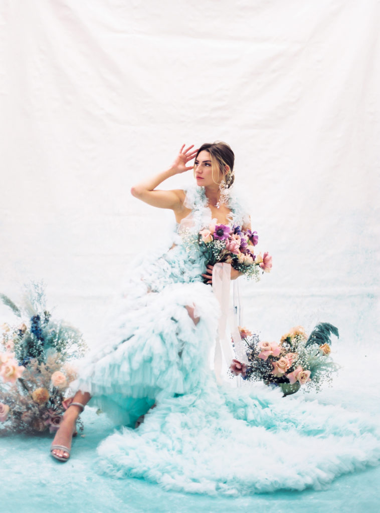
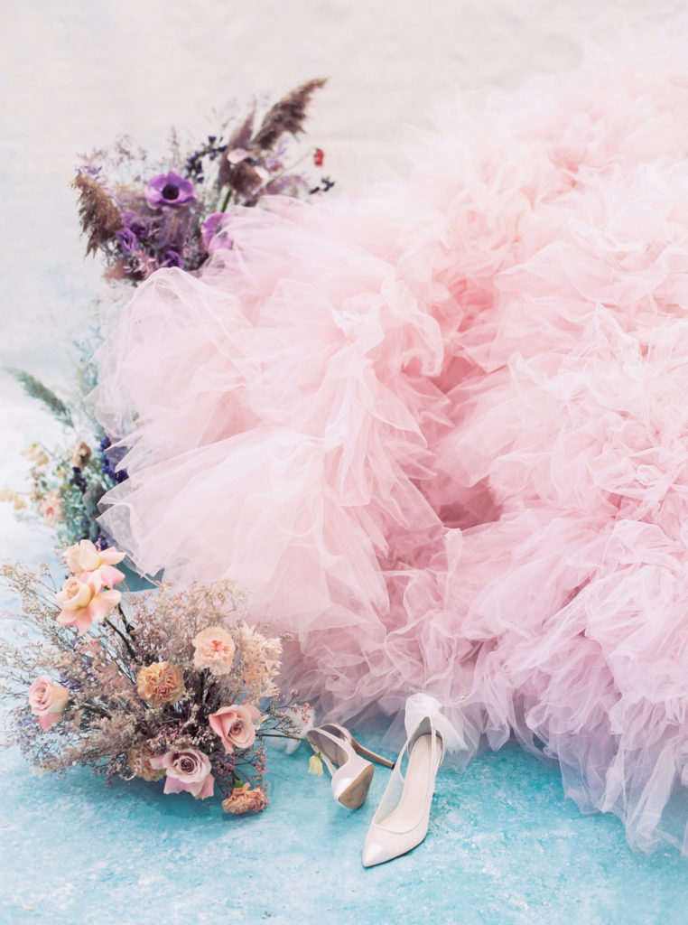
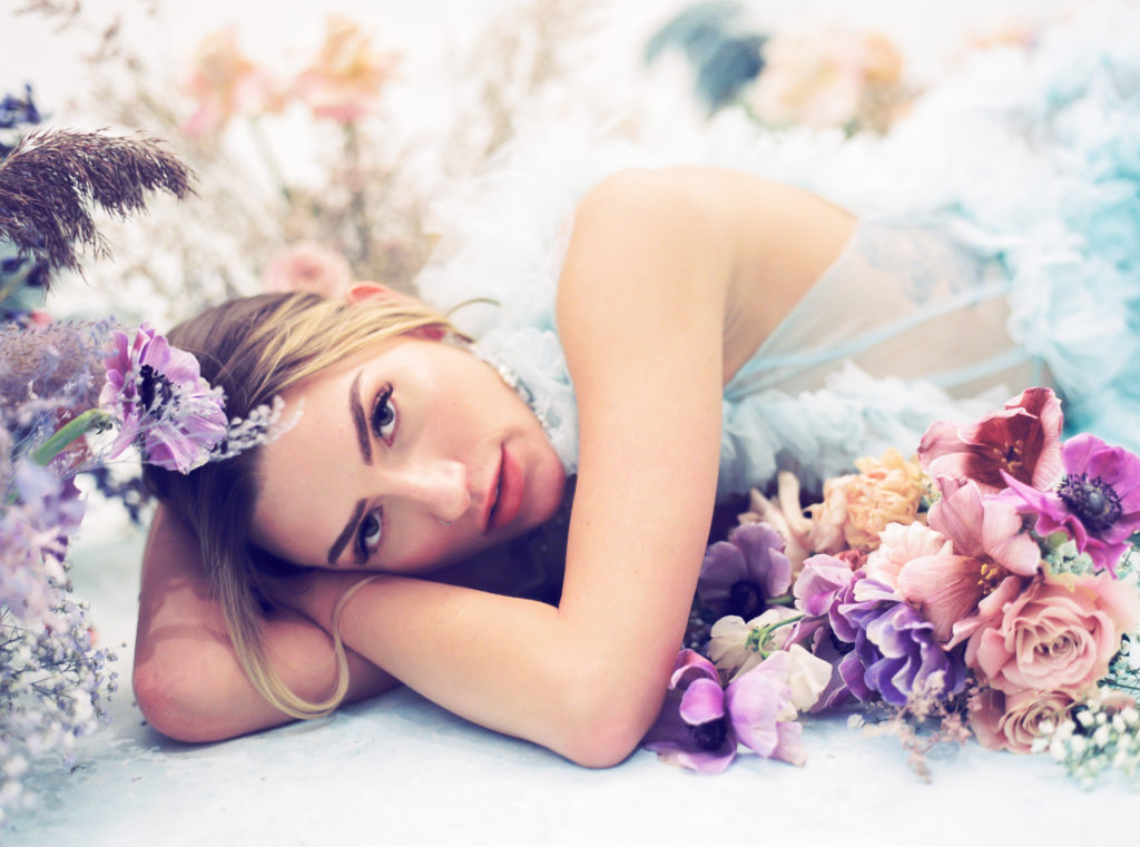
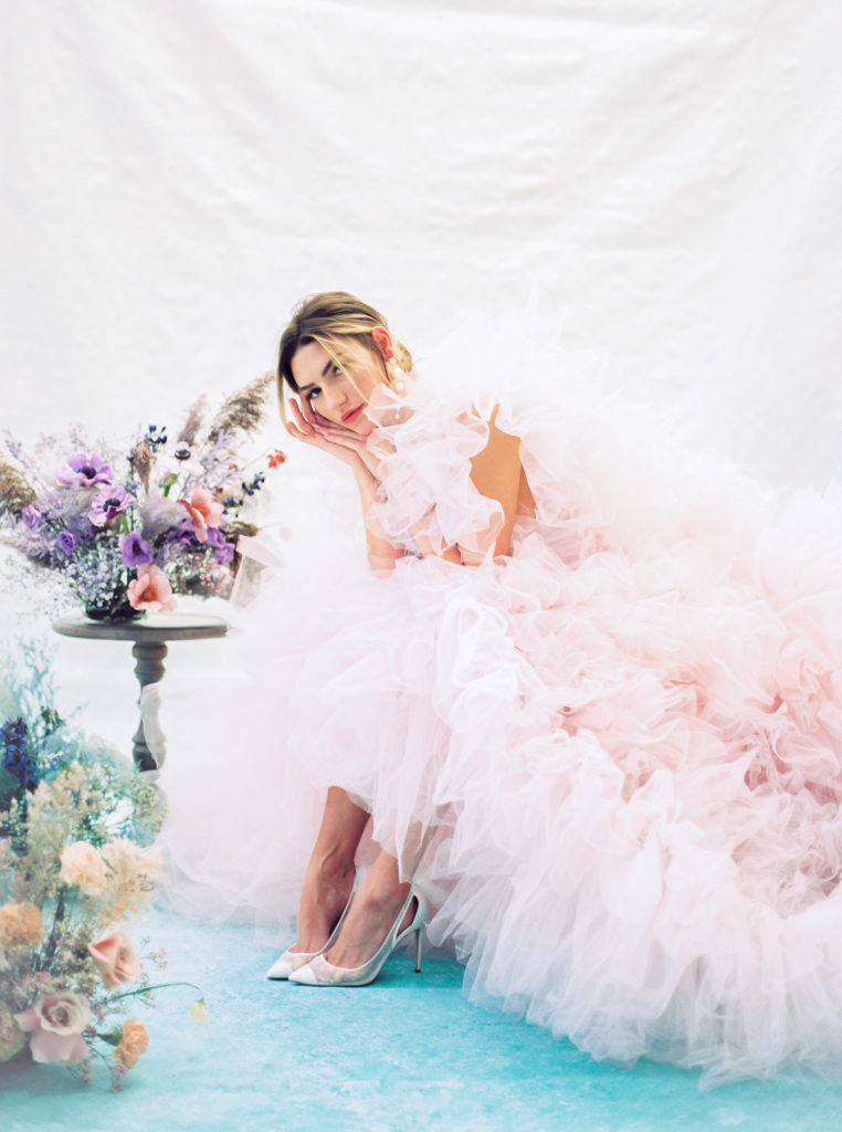
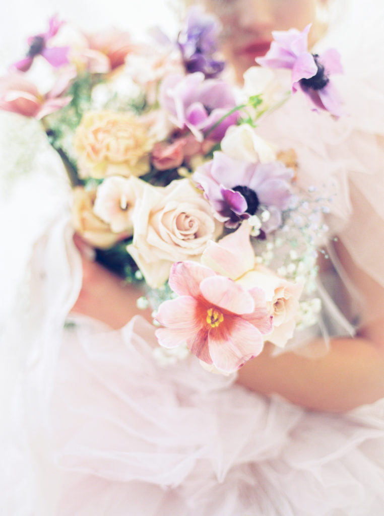
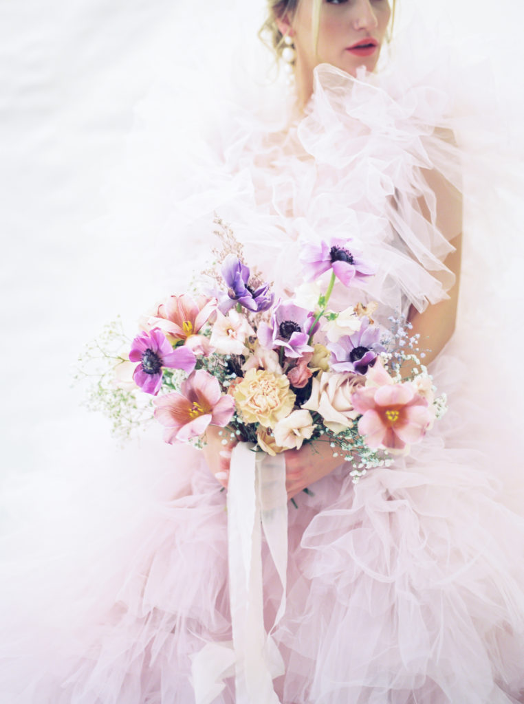
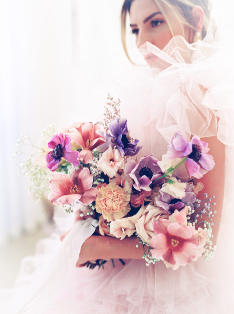
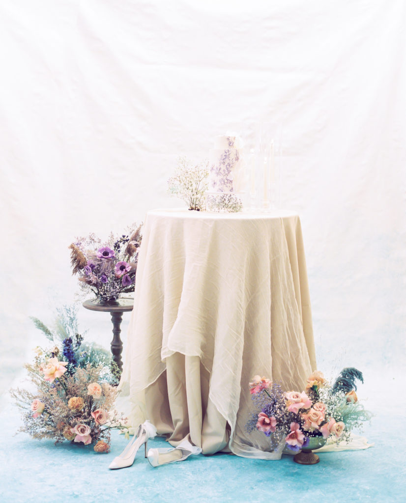
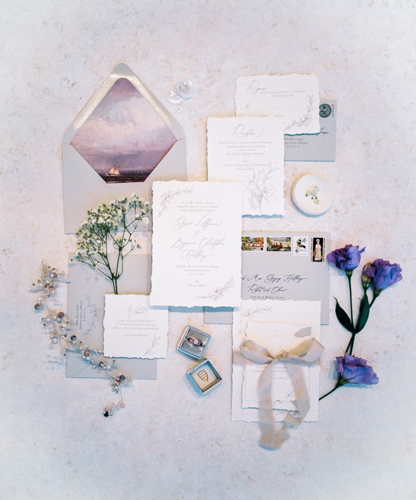
And, if I’m being extra honest with you my friend, I even spy some Very Peri in some of my past work (and have plans to incorporate it in 2022!) Check out some photos from a recent editorial shoot featuring the Pantone Color of the Year…
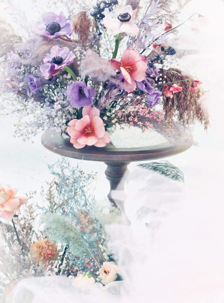
Well… I digress. I don’t hate Very Peri after all! I think when used properly, this slightly wild color can be used even in a very elevated look! What do you think of it? Love it? Hate it? Want to see more of it? I’d love to know, so drop me a comment below!
*Florals in photographs in the first gallery are not my own work. For vendor credit please view them on Pinterest.
Vendor Team for Editoral Shoot
Designer & coordinator: The Style Project – Jessica – @mkestyleproject
Photographer: Mémoires en Or – Mouna – @memoiresenor
Venue: Chez @chezweddingvenue
Florals: Michaela Mantarian – Michaela – @michaelamantarian
Model: Monika Klara @monikaklara_
Stationery: Emery Ann Design – Nicole – @emeryanndesign
Hair/ makeup: Diem Angie beauty – Pati@diemangiebeautyteam
Dresses: Millia London @millia.london
Cake: Cake Oeuvre – Nadia@cake_oeuvre
Shoes: Bella Belle @bellabelleshoes


Periwinkle has been my favorite color for many years. Love to see much more of it!
Yes, it’s really growing on me! I’m excited to see how floral designers use it this year!